Work / kbui
kbui
Shared buttons, forms, and dialogs for my projects.
I kept rebuilding the same buttons and forms for each project. I built kbui so my apps could share how those pieces behave and pick up fixes when I update them.
- Role
- Design and engineering
- Stack
- TypeScript, CSS, React 19, Base UI, Storybook
- Status
- In progress · as of 10 Nov 2026
- Domain
- Design tokens, accessible components and automated design checks.
Progress
One design system every project shares, with its rules checked by the build.
5 of 14 done, 9 planned
Next up: Field test
Updated
The problem
Say you select a few projects and click Archive. If the request fails, you should be able to try again without finding and selecting those projects all over again. I put that behaviour in kbui’s shared table. Each app decides what archiving means and makes the request. The table keeps the selection on failure and clears only the rows you submitted when it succeeds.
How it works
I keep shared values like button colours, spacing and text sizes in one file. These named settings are called design tokens.
The styles are plain CSS. An app can use them with React or supply the same markup itself.
The React components pair those styles with native controls and Base UI for behaviour like keyboard navigation and focus management.
How it stays consistent
I test the table with a request that fails and one that succeeds. The tests check that a second click while the request is running can’t send it twice, a failure keeps your selection, and a success clears only the rows you sent.
See it running
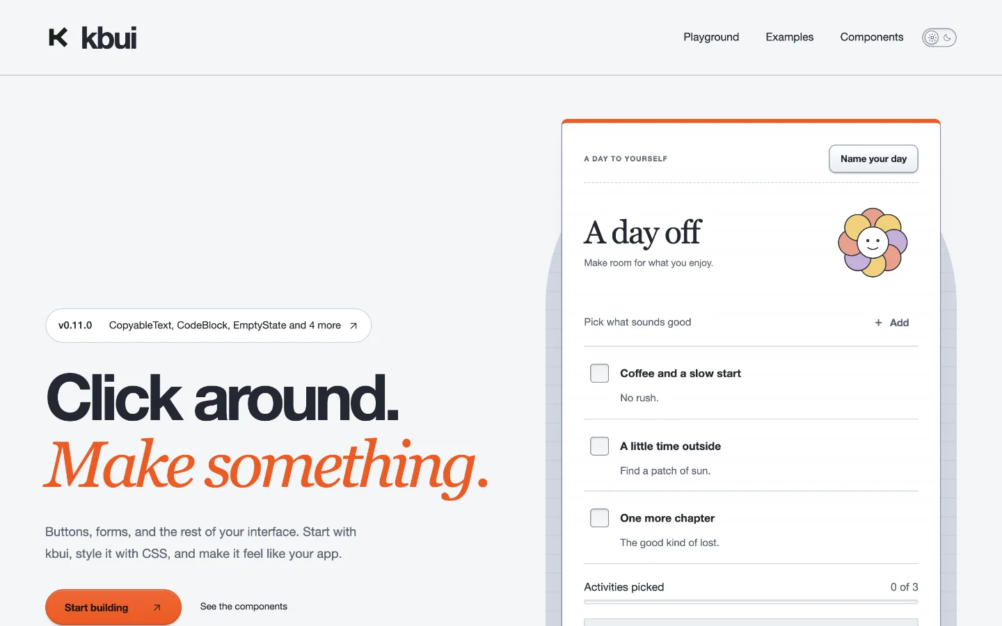
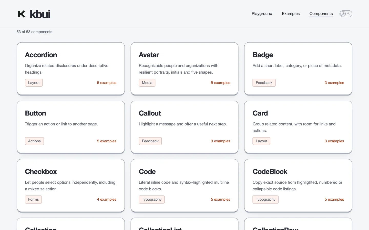
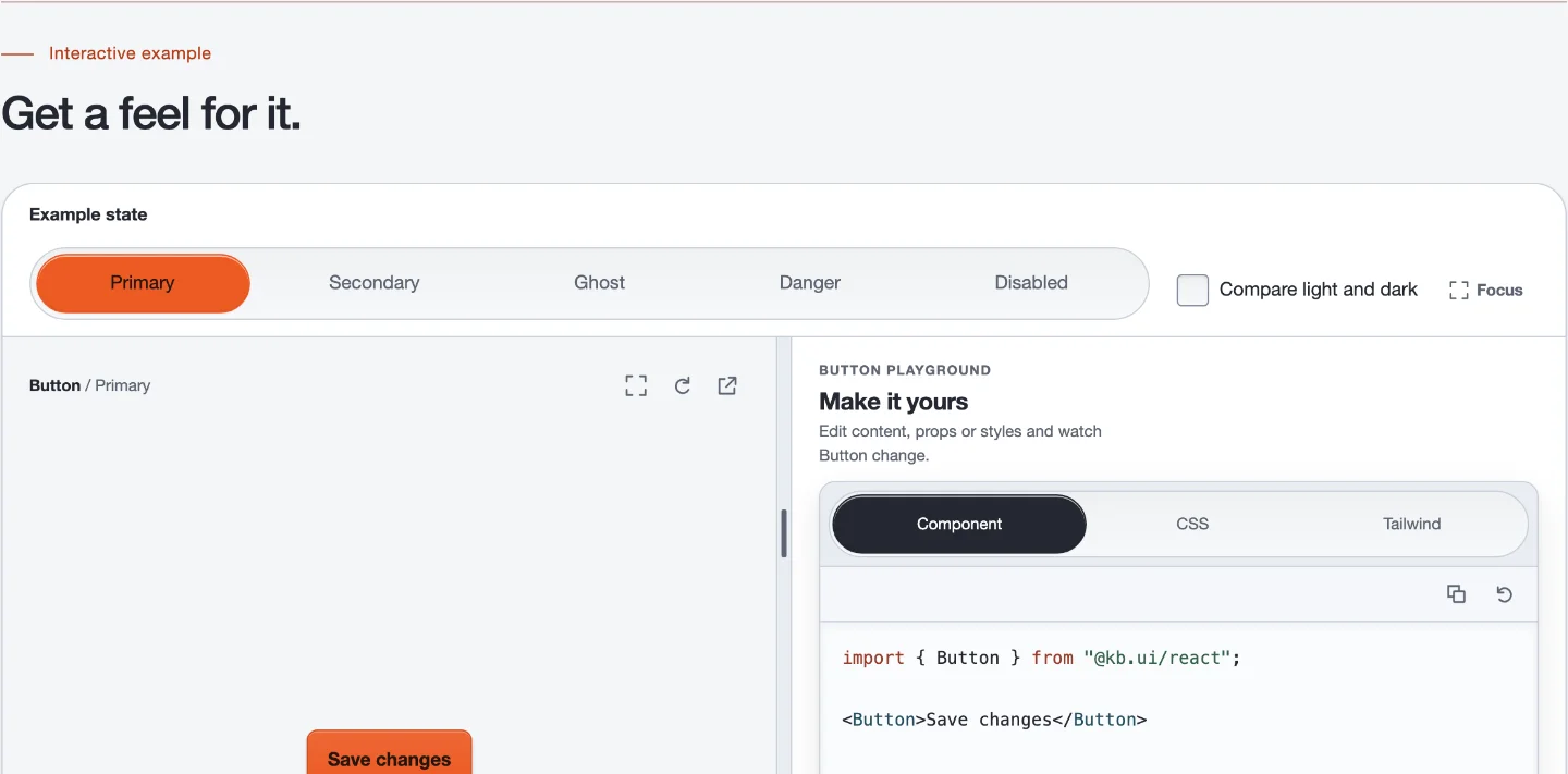
Every component has a page you can open: a live example you can click through its states, the code behind whichever state you picked, and the full list of its properties underneath. The planner on the front page is built the same way, out of the same parts.
Who uses it
Three things run on it today: this site, Bezl’s task screen, and the component site that documents it. Each release goes out as packages on npm, so a project can pin the exact version it was built against and upgrade when it suits.
What comes next
The library now covers most of what an ordinary app asks for, so the next stretch is less about adding components and more about the rules that hold them together: one shared way to lay a page out, and documentation that can’t fall behind the code. Further out, I’d like to describe a screen in plain English and have kbui check it against its own design rules. That last part doesn’t exist yet.
Full history
Done
Button, Input and Dialog
The first three components, Button, Input and Dialog, are in the library.
Done
Release 0.1.0
The first release installs and passes a quick check on Ubuntu, macOS and Windows.
Done
Every check passes on main
Every automated check on the main branch passes, including unit, packaging and component tests.
Done
Foundation
Tokens, CSS and 13 React components are released together, with every check passing.
Done
A first product screen
A real product screen built on kbui 0.4.0 was merged on 2026-10-23 with its checks passing, ahead of the deadline.
- · In progress · A real product screen is built on kbui 0.4.0 and passes its checks; it is not merged yet.
Planned
Field test
Will check whether screens from today's UI generators still break design and safety rules.
Planned
More components and layout
Will add about 20 components and layout building blocks, enough to compose real screens.
Planned
One source for agents and components
Will generate what AI agents read about kbui from the same definitions the components use.
Planned
Rules that check screens
Will check and fix screens for safety, structure, design, layout and data fit.
Planned
Render and measure
Will render generated screens and measure quality, speed and cost at every stage.
Planned
Do people prefer it?
Will test whether people prefer screens checked and fixed by kbui over a leading alternative.
Planned
The same rules for every source
Will apply the same rules to hand-written code, coding agents and other generators' formats.
Planned
Edit one part of a screen, and nest other apps
Will let people change one part of a screen without regenerating it, and nest other apps safely.
Planned
Saved screens become components
Will turn screens people save into reusable patterns and real components.
Activity
665 commits in the last 12 weeks
| Day | Week of 19 Aug 2026 | Week of 26 Aug 2026 | Week of 2 Sep 2026 | Week of 9 Sep 2026 | Week of 16 Sep 2026 | Week of 23 Sep 2026 | Week of 30 Sep 2026 | Week of 7 Oct 2026 | Week of 14 Oct 2026 | Week of 21 Oct 2026 | Week of 28 Oct 2026 | Week of 4 Nov 2026 |
|---|---|---|---|---|---|---|---|---|---|---|---|---|
| Wednesday | 0 | 0 | 0 | 0 | 0 | 0 | 0 | 0 | 0 | 0 | 47 | 6 |
| Thursday | 0 | 0 | 0 | 0 | 0 | 0 | 0 | 0 | 0 | 41 | 85 | 2 |
| Friday | 0 | 0 | 0 | 0 | 0 | 0 | 0 | 0 | 28 | 32 | 178 | 0 |
| Saturday | 0 | 0 | 0 | 0 | 0 | 0 | 0 | 0 | 5 | 0 | 72 | 0 |
| Sunday | 0 | 0 | 0 | 0 | 0 | 0 | 0 | 0 | 0 | 0 | 0 | 0 |
| Monday | 0 | 0 | 0 | 0 | 0 | 0 | 0 | 0 | 0 | 60 | 68 | 0 |
| Tuesday | 0 | 0 | 0 | 0 | 0 | 0 | 0 | 0 | 0 | 28 | 13 | 0 |